官方github: https://github.com/RainCloudPlots/RainCloudPlots
Raincloud 的 Python 实现是一个名为 PtitPrince 的包,它写在 seaborn 之上,这是一个 Python 绘图库,用于从 pandas 数据帧中获取漂亮的绘图。
import pandas as pd
import seaborn as sns
import os
import matplotlib.pyplot as plt
#sns.set(style="darkgrid")
#sns.set(style="whitegrid")
#sns.set_style("white")
sns.set(style="whitegrid",font_scale=2)
import matplotlib.collections as clt
import ptitprince as pt
#图片保存及输出设置
savefigs = True
figs_dir = '../figs/tutorial_python'
if savefigs:
# Make the figures folder if it doesn't yet exist
#如果没有找到文件夹,先创建此文件夹
if not os.path.isdir('../figs/tutorial_python'):
os.makedirs('../figs/tutorial_python')
def export_fig(axis,text, fname):
if savefigs:
axis.text()
axis.savefig(fname, bbox_inches='tight') df = pd.read_csv ("simdat.csv", sep= ",")
df.head()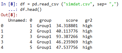
该图可以让读者初步了解数据集:哪个组的平均值更大,这种差异是否可能显着。 此图中仅显示每组分数的平均值和标准差。
f, ax = plt.subplots(figsize=(7, 7))
sns.barplot(x = "group", y = "score", data = df, capsize= .1)
plt.title("Figure P1\n Bar Plot")
if savefigs:
    plt.savefig('.\\figs\\tutorial_python\\figureP01.png', bbox_inches='tight')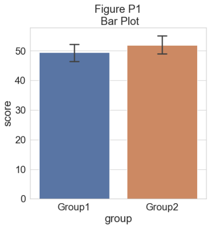
为了了解我们的数据集的分布,我们可以绘制一个“云”,即直方图的平滑版本:
# plotting the clouds
f, ax = plt.subplots(figsize=(7, 5))
dy="group"
dx="score"
ort="h"
pal = sns.color_palette(n_colors=1)
ax=pt.half_violinplot(x=dx, y=dy, data=df, palette=pal, bw=.2, cut=0., scale="area", width=.6, inner=None, orient=ort)
plt.title("Figure P2\n Basic Rainclouds")
if savefigs:
    plt.savefig('.\\figs\\tutorial_python\\figureP02.png', bbox_inches='tight')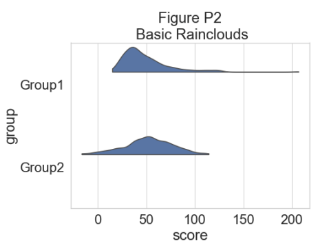
为了更精确地了解分布并说明数据中的潜在异常值或其他模式,我们现在添加“雨”,即数据点的简单单维表示:
# adding the rain
f, ax=plt.subplots(figsize=(7, 5))
ax=pt.half_violinplot(x=dx, y=dy, data=df, palette=pal, bw=.2, cut=0., scale="area", width=.6, inner=None, orient=ort)
ax=sns.stripplot(x=dx, y=dy, data=df, palette=pal, edgecolor="white", size=3, jitter=0, zorder=0, orient=ort)
plt.title("Figure P3\n Raincloud Without Jitter")
if savefigs:
    plt.savefig('.\\figs\\tutorial_python\\figureP03.png', bbox_inches='tight')
# adding jitter to the rain
f, ax =plt.subplots(figsize=(7, 5))
ax=pt.half_violinplot(x=dx, y=dy, data=df, palette=pal, bw=.2, cut=0., scale="area", width=.6, inner=None, orient=ort)
ax=sns.stripplot(x=dx, y=dy, data=df, palette=pal, edgecolor="white", size=3, jitter=1, zorder=0, orient=ort)
plt.title("Figure P4\n Raincloud with Jittered Data")
if savefigs:
    plt.savefig('.\\figs\\tutorial_python\\figureP04.png', bbox_inches='tight')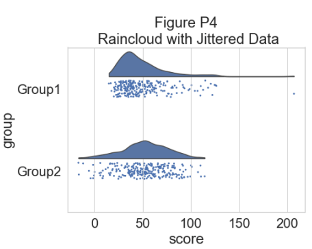
这样可以很好地了解数据点的分布情况,但中位数和四分位数并不明显,很难一目了然地确定统计差异。 因此,我们添加了一个“空”箱线图来显示中位数、四分位数和异常值:
#adding the boxplot with quartiles
f, ax=plt.subplots(figsize=(7, 5))
ax=pt.half_violinplot(x=dx, y=dy, data=df, palette=pal, bw=.2, cut=0.,
                      scale="area", width=.6, inner=None, orient=ort)
ax=sns.stripplot(x=dx, y=dy, data=df, palette=pal, edgecolor="white",
                 size=3, jitter=1, zorder=0, orient=ort)
ax=sns.boxplot(x=dx, y=dy, data=df, color="black", width=.15, zorder=10,
               showcaps=True, boxprops={'facecolor':'none',"zorder":10},
               showfliers=True, whiskerprops{'linewidth':2,"zorder":10},
               saturation=1, orient=ort)
plt.title("Figure P5\n Raincloud with Boxplot")
if savefigs:
    plt.savefig('../figs/tutorial_python/figureP05.png', bbox_inches='tight')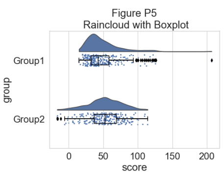
现在我们可以设置一个调色板来表征两组:
#adding color
pal="Set2"
f, ax=plt.subplots(figsize=(7, 5))
ax=pt.half_violinplot(x=dx, y=dy, data=df, palette=pal, bw=.2, cut=0.,
                      scale="area", width=.6, inner=None, orient=ort)
ax=sns.stripplot(x=dx, y=dy, data=df, palette=pal, edgecolor="white",
                 size=3, jitter=1, zorder=0, orient=ort)
ax=sns.boxplot(x=dx, y=dy, data=df, color="black", width=.15, zorder=10,
              showcaps=True, boxprops={'facecolor':'none',"zorder":10},
              showfliers=True, whiskerprops={'linewidth':2,"zorder":10},
              saturation=1, orient=ort)
plt.title("Figure P6\n Tweaking the Colour of Your Raincloud")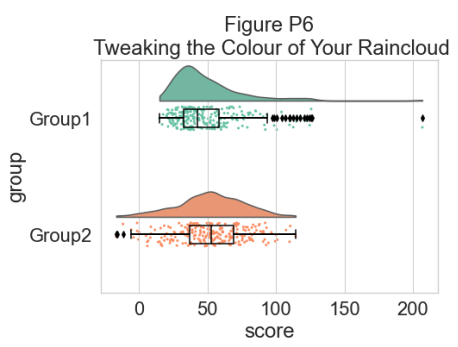
我们可以使用函数 pt.Raincloud 来添加一些自动化:
#same thing with a single command: now x **must** be the categorical value
dx="group"; dy="score"; ort="h"; pal="Set2"; sigma=.2
f, ax=plt.subplots(figsize=(7, 5))
pt.RainCloud(x=dx, y=dy, data=df, palette=pal, bw=sigma,
             width_viol = .6, ax = ax, orient = ort)
plt.title("Figure P7\n Using the pt.Raincloud function")
if savefigs:
    plt.savefig('../figs/tutorial_python/figureP07.png', bbox_inches='tight')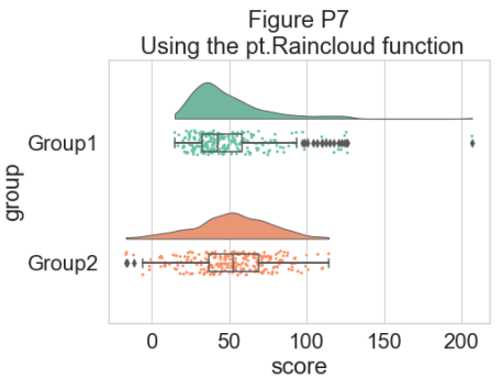
‘move’ 参数可用于移动箱线图下方的雨量,在某些情况下提供更好的原始数据可见性:
#moving the rain below the boxplot
dx="group"; dy="score"; ort="h"; pal="Set2"; sigma=.2
f,ax=plt.subplots(figsize=(7, 5))
ax=pt.RainCloud(x=dx, y=dy, data=df, palette=pal, bw=sigma,
                 width_viol=.6, ax=ax, orient=ort, move=.2)
plt.title("Figure P8\n Rainclouds with Shifted Rain")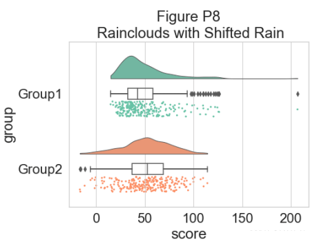
此外,raincloud 函数同样适用于列表或 np.array,如果您更喜欢使用它们而不是数据框输入:
# Usage with a list/np.array input
dx=list(df["group"]); dy=list(df["score"])
f, ax=plt.subplots(figsize=(7, 5))
ax=pt.RainCloud(x=dx, y=dy, palette=pal, bw=sigma,
                 width_viol=.6, ax=ax, orient=ort)
plt.title("Figure P9\n Rainclouds with List/Array Inputs")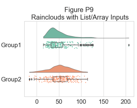
对于某些数据,您可能希望将雨云的方向翻转为“petit prince”图。 您可以使用 pt.RainCloud 函数中的 ‘orient’ 标志来执行此操作:
# Changing orientation
dx="group"; dy="score"; ort="v"; pal="Set2"; sigma=.2
f, ax=plt.subplots(figsize=(7, 5))
ax=pt.RainCloud(x=dx, y=dy, data=df, palette=pal, bw=sigma,
                 width_viol=.5, ax=ax, orient=ort)
plt.title("Figure P10\n Flipping your Rainclouds")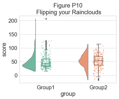
还可以更改用于生成数据概率分布函数的平滑核。 为此,您调整 sigma 参数:
#changing cloud smoothness
dx="group"; dy="score"; ort="h"; pal="Set2"; sigma=.05
f, ax=plt.subplots(figsize=(7, 5))
ax=pt.RainCloud(x=dx, y=dy, data=df, palette=pal, bw=sigma,
                 width_viol=.6, ax=ax, orient=ort)
plt.title("Figure P11\n Customizing Raincloud Smoothness")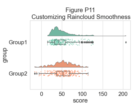
最后,使用 pointplot 标志,您可以添加一条连接组平均值的线。 这对于更复杂的数据集很有用,例如重复测量或因子数据。 下面我们通过改变各个图的色调、不透明度或闪避元素来说明使用雨云绘制此类数据的几种不同方法:
#adding a red line connecting the groups' mean value (useful for longitudinal data)
dx="group"; dy="score"; ort="h"; pal="Set2"; sigma=.2
f, ax=plt.subplots(figsize=(7, 5))
ax=pt.RainCloud(x=dx, y=dy, data=df, palette=pal, bw=sigma,
                 width_viol=.6, ax=ax, orient=ort, pointplot=True)
plt.title("Figure P12\n Adding Lineplots to Emphasize Factorial Effects")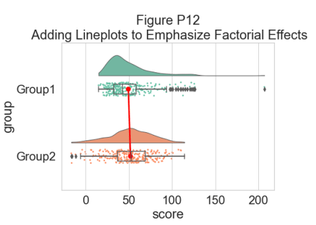
另一个灵活的选择是使用 Facet Grids 来分隔不同的组或因子水平,
如下所示:
# Rainclouds with FacetGrid
g=sns.FacetGrid(df, col="gr2", height=6)
g=g.map_dataframe(pt.RainCloud, x="group", y="score", data=df, orient="h")
g.fig.subplots_adjust(top=0.75)
g.fig.suptitle("Figure P13\n Using FacetGrid for More Complex Designs",  fontsize=26)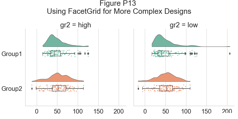
作为一种替代方法,可以使用色调输入将不同的子组直接绘制在彼此之上,从而促进它们的比较:
# Hue Input for Subgroups
dx="group"; dy="score"; dhue="gr2"; ort="h"; pal="Set2"; sigma=.2
f, ax=plt.subplots(figsize=(12, 5))
ax=pt.RainCloud(x=dx, y=dy, hue=dhue, data=df, palette=pal, bw=sigma,
                 width_viol=.7, ax=ax, orient=ort)
plt.title("Figure P14\n Rainclouds with Subgroups")
为了提高该图的可读性,我们使用相关标志(0-1 alpha 强度)调整 alpha 级别:
# Setting alpha level
f, ax=plt.subplots(figsize=(12, 5))
ax=pt.RainCloud(x=dx, y=dy, hue=dhue, data=df, palette=pal, bw=sigma,
                 width_viol=.7, ax=ax, orient=ort , alpha=.65)
plt.title("Figure P15\n Adjusting Raincloud Alpha Level")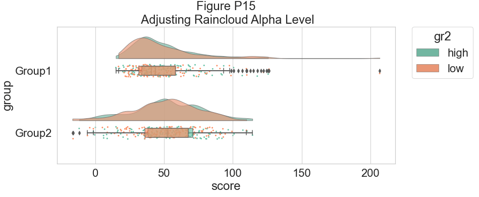
我们可以将 dodge 标志设置为 true,而不是让两个箱线图相互混淆,从而增加交互性:
#The Doge Flag
f, ax=plt.subplots(figsize=(12, 5))
ax=pt.RainCloud(x=dx, y=dy, hue=dhue, data=df, palette=pal, bw=sigma,
                 width_viol=.7, ax=ax, orient=ort , alpha=.65, dodge=True)
plt.title("Figure P16\n The Boxplot Dodge Flag")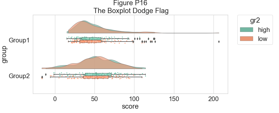
最后,我们可能希望在我们的图表中添加一个传统的线图,以帮助检测因子主效应和交互作用。
例如,我们在每个箱线图中绘制了平均值:
#same, with dodging and line
f, ax=plt.subplots(figsize=(12, 5))
ax=pt.RainCloud(x=dx, y=dy, hue=dhue, data=df, palette=pal, bw=sigma,
                width_viol=.7, ax=ax, orient=ort , alpha=.65,
                dodge=True, pointplot=True)
plt.title("Figure P17\n Dodged Boxplots with Lineplots")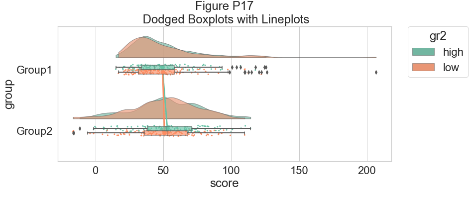
这是相同的图,但现在使用“移动”参数再次将单个观测值移动到箱线图下方:
#moving the rain under the boxplot
f, ax=plt.subplots(figsize=(12, 5))
ax=pt.RainCloud(x=dx, y=dy, hue=dhue, data=df, palette=pal, bw=sigma,
               width_viol=.7, ax=ax, orient=ort , alpha=.65, dodge=True,
               pointplot=True, move=.2)
plt.title("Figure P18\n Shifting the Rain with the Move Parameter")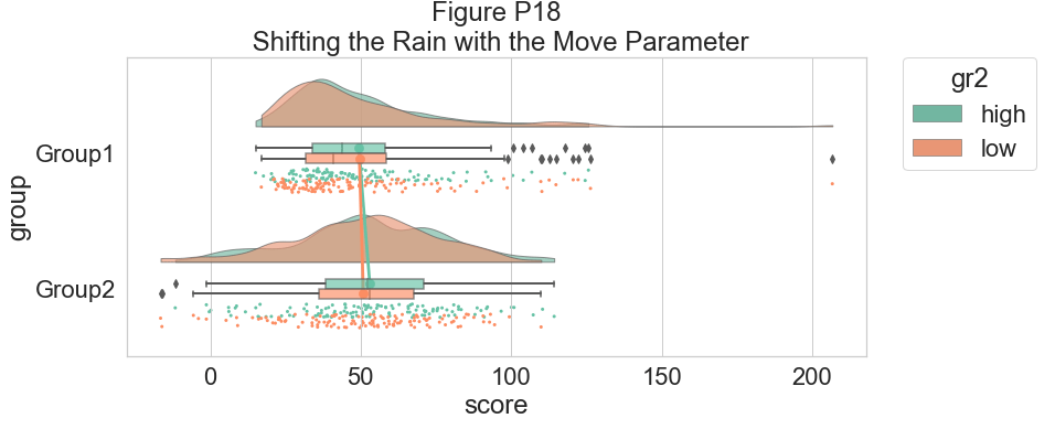
作为我们的最后一个示例,我们将考虑具有两组和三个时间点的复杂重复测量设计。 目标是说明我们复杂的相互作用和主要影响,同时保持雨云图的透明性:
# Load in the repeated data
df_rep=pd.read_csv("repeated_measures_data.csv", sep=",")
df_rep.columns=["score",  "timepoint", "group"]
df_rep.head()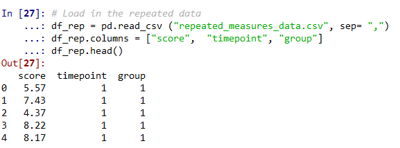
# Plot the repeated measures data
dx="group"; dy="score"; dhue="timepoint"; ort="h"; pal="Set2"; sigma=.2
f, ax=plt.subplots(figsize=(12, 5))
ax=pt.RainCloud(x=dx, y=dy, hue=dhue, data=df_rep, palette=pal, bw=sigma, width_viol=.7,
               ax=ax, orient=ort , alpha=.65, dodge=True, pointplot=True, move=.2)
plt.title("Figure P19\n Repeated Measures Data - Example 1")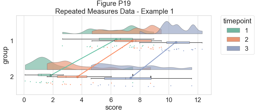
# Now with the group as hue
dx="timepoint"; dy="score"; dhue="group"
f, ax=plt.subplots(figsize=(12, 5))
ax=pt.RainCloud(x=dx, y=dy, hue=dhue, data=df_rep, palette=pal, bw=sigma, width_viol=.7,
                ax=ax, orient=ort , alpha=.65, dodge=True, pointplot=True, move=.2)
plt.title("Figure P20\n  Repeated Measures Data - Example 2")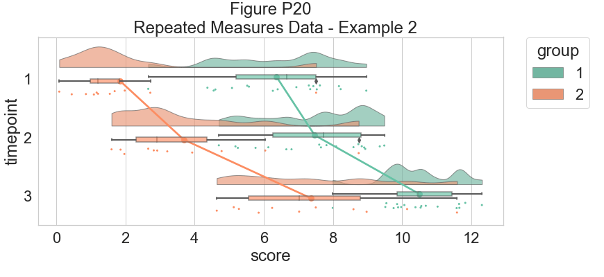
到此这篇关于python绘制云雨图raincloud plot的文章就介绍到这了,更多相关python绘制云雨图内容请搜索Devmax以前的文章或继续浏览下面的相关文章希望大家以后多多支持Devmax!